I had such a hard time deciding what to do for this week's MFT Idol contest. Our challenge was to make a one layer card using only MFT stamps (of course!). Way back in January I made this one layer card for the MFT guest designer contest (and won an ambassador spot with it!) so I felt like I had used up all my one layer ideas!
I decided to play with the MFT digital paper packs and see what I could come up with. Here is the card I ended up creating - it took a little playing to get it right - but I did all my work in Microsoft Word (I lost my Photoshop when we upgraded to Vista!).

I thought that I would maybe post some screen shots here so you could see how I went about it - in case you want to try it for yourself! Jody Morrow created some awesome tutorials on how to purchase, download, locate, open and print the papers using only the document viewer (I linked you to the first one, but there's quite a few of them in that same forum). But since we were limited to one layer, I needed to make a few adjustments.
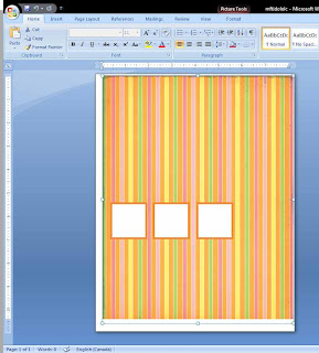
First I opened a new document in Word, then I used the Insert Picture command and selected my digital paper (they are downloaded as jpegs), in this case one of the papers from the Spring pack. I reduced the margins on my Word document as low as I could and stretched the paper out by grabbing the corner and dragging. Once I decided on my card size (6" x 4.5") and orientation, I was able to determine where to drop my boxes. To make the boxes, I simply used the text box tool and drew a box on top of the paper image. I then adjusted the size of the box (to 1.5") and copied and pasted it twice so I'd have 3 identical boxes. I lined up the boxes by using the rulers on the top and left sides.
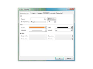
 Once I had my text boxes placed where I wanted them, I decided that instead of having black outlines, I wanted them to have coloured borders so it would look like my boxes were layered onto cardstock. By right clicking on my box, I was able to select Format Text Box which is shown below. I changed the line to a weight of 6 pt. and changed the colour. For the colour, I wanted to use SU's Pumpkin Pie, so I grabbed the RGB code for Pumpkin Pie off of Splitcoast (in the downloads forum) and selected my custom colour for the line.
 Once I printed off my paper, I trimmed it down to size. I then used Eclipse masking strips (so much better than post-its!) to mask around the squares so I could stamp my Hooga Boogas in the squares. I coloured them, sponged the edges of the card and outlined the boxes with a W3 copic. I decided to take advantage of the paper's striped design and weave some ribbon. I made small slits in the border of the stripes and fed the ribbon through. I think the rest is fairly self-explanatory, but shoot me an email if you have any questions!
Sorry for the epic post, but I thought there might be people who didn't know that they could use Word with their digital paper packs.
So as always, voting opens tonight at 10pm and remains open until Wed. at 10pm EST. Would you consider voting for me? I'll come back tonight and edit with the link to the voting thread! Thanks for all your kind comments and support! It really means the world to me!

5 comments:
Kerry this is amazing!! I love it. I was going to ask about the shadow, great idea using the copic. You know I am voting :).
This is a TRES clever way to make a one layer card, you smartie pants. I love the use of the copcs as Jamie mentioned, makes the windows pop.
Well I for one didn't know I could use MS Word for the digi paper packs. Thanks for the tutorial!
I find one layer cards so difficult but this one is fabulous Kerry! Adorable!!
Super cute lady! I love the peeking ribbon.
Post a Comment